Posts

Module 1: Introducing Python
Image
Module 1: Introducing Python This week, we learned about expectations for this class in the form of deliverables and blog posts and went through an introduction to Python, IDLE, Spyder, and Python within ARCPro. We also learned how to calculate using pseudocode and about the Zen of Python, which I thought was very thought provoking and really liked.  I felt that this lab was pretty easy to follow and learn from, but I can see the great opportunity for things to become more complicated as we go along. The most trouble I experienced was retrieving The Zen of Python from Spyder or Python on ArcGIS Pro. I ultimately did it, but I am not confident in my skills there. I am also iffy about pseudocode and will find out if I am on the right track when my assignment is graded and by the feedback I receive. I really appreciated that the lab for Module 1 was useful for the course overall. A lot of time was previously spent creating folders and transferring data each week in my pre...

Final

Image

Module 10 - Supervised Classification

Image
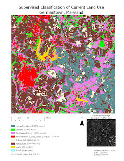
Exercise 4 required me to combine the skills I learned in the previous exercises to create a map detailing the land use for an area in Germantown, Maryland. To create this map, I needed to go back through each of the previous steps to choose the best course of action for this type of map. I created classes for each of the different land uses, addressed any spectral confusion, and then consolidated like-classes. I chose colors for each class that stood out from each other. Finally I opened my map in arcpro, added essential elements, and exported my map.

Module 9 - Unsupervised Classification

Image
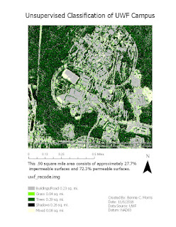
In exercise 2, I used ERDAS imagine to manually separate a high resolution aerial image of the UWF campus into classes. Initially, I created 50 classes with the Unsupervised Classification function so that there would be enough classes to clearly translate the image and then consolidated those classes into 5 independent (including mixed) classes using the “Recode” function. I chose to turn the original layer on and off while classifying the image instead of the swipe, flicker, or blend methods, as this was the easiest for me. I did the math to determine how much of the area was permeable an impermeable and wrote the percentages on the map. Towards the end of my map creation, while working in layout view, I ran into the familiar problem of the cursor getting stuck on the rotate function. I restarted Argo Apps several times to fix this issue. 

Module 8 - Thermal & Multispectral Analysis

Image
In exercise 4, I picked an area of the map that I found particularly interesting, which is an island in the river. I picked my favorite band combination/setting and then explained in the map notes why I made these decisions.

Module 7

Image
In exercise 5, I put many of the skills I had learned together to create deliverable maps that identified certain features that represented variations in the histogram. I thought it was interesting to change band combinations and colors to determine what the features were and enjoyed using my best judgment to represent the data. I did most of my adjustments in arc maps after using the subset and chip tool to choose the most representative part of the map in arc pro. The only problem I had was with my cursor defaulting to the pan and rotate tools, as it has before in ArcPRO, which necessitated me logging out and back into argo apps several times.

Module 6 - Spatial Enhanceme

Image
I created a map deliverable that utilized the best method of reducing visibility of the lines I could find. I tried many different types of kernel filters and determined that a 3x3 high pass filter looked the best to me. I also tried edge detect, edge enhance, other sharpen filters, and running the fourier transformation again on the fourier1.img layer, but none of the enhancements made the image as clear. I also attempted to create a custom kernel like the example, but I was unable to run this successfully.

Module 5b - Intro to ERDAS Imagine and Digital Data

There was not a map deliverable for this lab, but in exercise 4  we created a map that showed the percent area of the most erosive soils. This exercise reminded me of previous tasks I have completed with ArcMap, but it seemed to be an easier process. I can appreciate how this function will be useful for many different data types including stand type, population density, and other trends that can be uncovered by using formulas to select specific characteristics.

Module 5a - Intro to ERDAS Imagine and Digital Data

Image
This map shows images in classes by area in a forested section of Washington state. It was  created  by a combination of ERDAS Imagine and ArcPro. Step 3 caused me the most problems, but it was not an extremely difficult task. I opened my tm_class.img to the viewer, opened the attribute tab, and added an area field. It was necessary that I change the name of the field so that it would show up in arcpro (I missed this step the first time). Then I went through the process of removing the layer so that the save dialog box would appear with no  errors. Then I reopened the .img and created a subset image of the map by using an inquire box named “tm_subset.img”. The errors began when I tried to run ARCPro. The program gave me a “loading map…” screen no matter how many times I force-quit, logged off, or even restarted my computer. After that issue was resolved, I was able to add my new  subset image to the map and add a legend and essential elements. I then...

Module 4 - Ground Truthing and Accuracy Assessment

Image
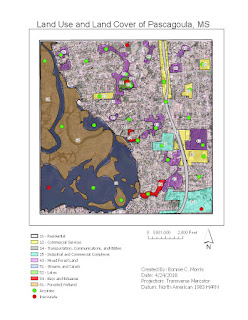
This week, we checked the accuracy of our land cover classifications from last week by conducting an accuracy assessment using the street view on google maps. I used a random sampling method so that I could choose as many unique locations as possible. Because so much of the map falls under the residential and Streams and Canal categories, I felt it was important to verify the smaller areas like Bays and Estuaries, Lakes, etc. were correct. First, I zoomed into the map to select smaller locations (around 20). Then I zoomed out and filled in the gaps with more random points for verification.

Module 3 - Land Use / Land Cover Classification

Image
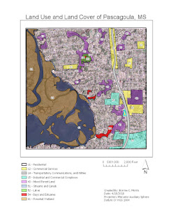
This week we were instructed to differentiate land uses and classifications on a map using LULC classification. The following is information from my process summary explaining the classifications and how I went about creating each feature: 11 – Residential: (Where people live i.e. apartment complexes, subdivisions, trailer parks, neighborhoods) I labeled areas with small houses spaced sporadically or close together as residential. Because houses were located all over the map, this class takes up the largest portion. 12 – Commercial Services: (Places of business and public service i.e. stores, restaurants, schools, office buildings) I labeled areas by the major road as commercial services because this is typically where those services are located. I also found what appeared as a school, a retail store, and a cluster of uniform buildings with flat roofs as commercial.  14 – Transportation, Communications, and Utilities: ( Areas used for transport and travel ) I labeled the...

Module 2 - Visual Interpretation

Image
This week, we were tasked with identifying different features and elements of aerial photos in Arc Pro. This was my first time using arc pro extensively and it took quite a bit of patience to figure out how to navigate the program. Ultimately, I did complete my maps, but I will be use provided help from now on! The following information is from my process summary for future reference: Exercise 1 The objective of exercise 1 was to identify different textures and tones on an aerial raster image. I accomplished this by creating polygons that outlined distinguishable areas for each of these criteria including Tone: Very light, light, medium, dark very dark – and – Texture: Very fine, fine, mottled, coarse, very coarse.  This exercise caused me the most trouble because I had never used Arc Pro before. After adding my input files into the folder and reading the instructions and helpful tips from ESRI, I still could not figure out how to create a feature class. Finall...

Final Project

Image
For our final project, we were instructed to create a map displaying two thematic datasets also known as a bivariate map. This was very similar to the map we created in week 7 and I expanded upon the skills I learned in that module to create a more visually appealing and coherent map. I chose to work with the first scenario for the objective of my map. I created a map that could be used by the Washington Post to compare mean SAT scores and test participation rates of high school seniors in 2014. Both of these statistics can be compared to state size on a larger scale as I used the United States Albers Equal Area Conic projection. Since this map focuses on the comparison of average test scores to participation percentages, two comparable data presentation types were used.   For test scores, I elected to use graduated symbols so that I could separate the data into the same number of classes as the participation percentage variables. These symbols were separated into five c...

Module 12 Lab: Google Earth

Image
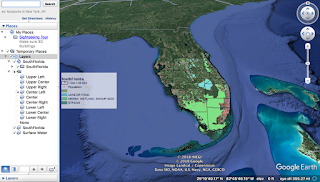
This week, we converted our week 10 dot density mxd on ArcMap to a kmz file that is viewable on Google Earth. This is very useful for communicating data organized in ArcMap with people who are not familiar with the program. First, we made adjustments to our original map and exported it as a kmz file. The only adjustment I needed to make was simplifying my legend. Then I ran the Map to KML tool and the Layers to KML tool. The Map to KML process took an extremely long time (over ten hours within multiple attempts) and I ran the tool several times concerned that an error had occurred. I enlarged my dot density to try to speed up this process. I ultimately created a new file, copy and pasted my old layers over, and used ArcCatalog for this process, which worked like a charm. Once it was done I was able to open my files on Google Earth. After I viewed the map in Google Earth, I needed to change the solid fill of the layers to an outline within the program. Finally, I created a Google ...

Module 11 Lab: 3D Mapping

Image
This week, we were instructed to use the ESRI training module to learn about 3D maps. I studied their background, the data required to create them, and their applications.  Three dimensional mapping uses TINs, raster data, and z-values to create a map that shows depth. The values can portray proportional elevations of terrain and manmade features such as buildings.  In my process summary, I described why a 3D building map is advantageous: A 3D building layer reveals patterns that are not visible in 2D. As noted in ESRI training, 3D modules can help one visualize how buildings will interact and merge with other buildings and landscaping. They can also help one visualize a route more accurately as the buildings they will encounter can act as landmarks, a feature that is unavailable in a 2D map. There were three major parts of the lab. The first was the focused  solely  on ESRI training using ArcScene which was composed of six exercises.  Exerc...