Posts

Showing posts from March, 2018

Module 10 Lab: Dot Density Mapping

Image
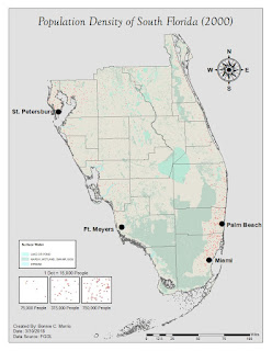
This week, we learned about dot mapping and created a dot map of South Florida's population density. Dot mapping is used to display information while revealing the underlying patterns in the enumeration units of raw data. This is accomplished by reviewing the concentration of dots on areas of a map. A dot equals a predetermined amount of a phenomenon and it is placed approximately where that phenomenon occurs. This reveals patterns in data, in this case, that the population of South Florida is more densely concentrated by Miami and St. Petersburg. There are three main ways to place the dots. For this map, the dots are geographically based, which is the most accurate and error reducing method. As noted in the instructions, creating this weeks lab was not extremely complicated, but there were a few steps that took a significant amount of time. The first was troubleshooting to find an appropriate size for the dots while maintaining that there was at least one dot in

Module 9 Lab: Flow Line Mapping

Image
This weeks module covered flow line mapping. Flow maps are used to show movement of people, commodities, ideas, technology, wind, and ocean currents as well as many other phenomena between locations. In this lab, we focused specifically on a distributive flow map that mapped the proportion of immigrants into the United States from different regions of the world using population data from 2007. According to the information given in our textbook, this map most directly aligns to the second subcategory of distributive flow maps. Each flow line is a different size, proportional to the number of immigrants traveling from its respective region. I determined the size of each line by applying a formula to the 2007 data for each region on an excel spreadsheet. Since visual hierarchy and a good figure-ground relationship are extremely important in flow line mapping, I stylized the flow lines with effects like drop shadow, 3D Extrude & Bevel, inner glow, and transparency to make them s

Module 8 Lab: Isarithmic Mapping

Image
This week we created two isarithmic maps, one with continuous tones and the other with hypsometric tints. It was important to explore both of these mapmaking styles as they display the same data presented in different ways.  The first important thing to note is how this data is collected and interpolated.  By implementing data prepared using the PRISM method, the maps we created are interpolated using the relationship of  location, elevation, coastal proximity, topographic orientation, vertical atmospheric layer, topographic position,  and orthographic effectiveness of the terrain to precipitation. This algorithm, created by Chris Daly, takes  into account variants such as rain shadows that would otherwise skew data on a map focusing strictly on the  relationship of elevation to precipitation. The first map we created was one with continuous symbology. Since the data was already presented with a stretched color scheme, there was not much editing to the data required to get the