Module 6 Lab: Data Classification
Module 6 was another very informative lab. The requirement was not too intense, but understanding the material required thorough study of the textbook chapters and lecture. We were instructed to make two maps of seniors (people over age 65) in Miami-Dade County, FL using four different classification methods: Equal Interval, Quantile, Standard Deviation, and Natural Break. One map used the percentage of seniors by census tract and the other used the total number of seniors by census tract.
Since I knew that the color ramp would need to be changed for standard deviation and because one of the "good example" maps I chose in the first module used this approach, I decided to use different colors for each classification method. In my opinion, this added an additional level of clarity to the map, without taking away from its purpose.
The four classification methods I used are defined below. For each, I'll start out with a description in my own words from my process summary and then tell how appropriate it is for an audience trying to determine locations with the greatest number of seniors.
Equal Interval: This classification method separates data into classes based on the range of the data. For example, 5 data classes with 20 as the interval would be created chronologically for a data with a maximum of 100 and a minimum of 0.
In my opinion, this is the best method for the data. It is straightforward and easy to understand for the audience because it separates each class into equal sections. The class with the most seniors is easily identifiable and comparable to the other classes.
Quantile: This
classification breaks the distribution into equal observations. The data is
placed into a class chronologically, which may result in some classes having a
larger range than others, but still an equal number of observations. The ranges
are set by the finding the midpoint between the highest value in one class and
the lowest value in the next class.
While this may be an effective method for a different objective, it is too specific for our purposes. We do not need to know how many times a certain observation took place, just the most populated areas overall.
Standard Deviation: This classification maps the frequency of data around the mean using the standard deviation. For example, if the mean is 176 and the standard deviation is 7.4, five classes could be created and each would have a range of 7.4. The middle class, where most of the occurs in this classification, would be a half of a deviation above and below the mean.
This method is not appropriate for this data because the average number of seniors is not relevant.
Natural Break: This
classification uses algorithms to make values within each class similar, but
classes as independent as possible.
This method is useful, but not as effective as equal distribution in my opinion. Because the emphasis is on differentiating the class sizes, it is more difficult to pinpoint a specific quantity of seniors.
Finally, we were instructed to choose between the map with the percentage of senior citizens in census tract vs. the number of senior citizens in the census tract. I felt that the number was more appropriate because it is comparable entire population of the county and not dependent on the diversity of the census tract.
This is the map I chose:
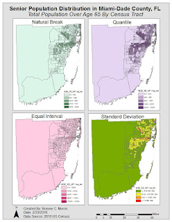
For some reason, my font color will not save on blogger when I update the post after attempting several times. I apologize that some of the text is blue.


Comments
Post a Comment