Module 10 Lab: Dot Density Mapping
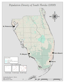
This week, we learned about dot mapping and created a dot map of South Florida's population density. Dot mapping is used to display information while revealing the underlying patterns in
the enumeration units of raw data. This is accomplished by reviewing the
concentration of dots on areas of a map. A dot equals a predetermined amount of
a phenomenon and it is placed approximately where that phenomenon occurs. This reveals
patterns in data, in this case, that the population of South Florida is more densely concentrated by Miami and St. Petersburg. There are three main ways to place the dots. For this map, the dots are geographically based, which is the most accurate and error reducing method.
As noted in the instructions, creating this weeks lab was not extremely complicated, but there were a few steps that took a significant amount of time. The first was troubleshooting to find an appropriate size for the dots while maintaining that there was at least one dot in each county. This was a lot easier said than done. When I made the dots larger for more visibility the value that each dot represented was too large to display in certain counties. I settled for a medium sized dot, but unfortunately they shrunk to a much smaller size when I exported the map. I included a screenshot of my map in ArcMap in the dropbox and on this blog to demonstrate my issue.
The second was adding masking to make the maps only visible on the urban layer. The process worked perfectly, but it was necessary to turn masking off until the very end so that the program would not freeze, as instructed.
The next steps were pretty straightforward. I added the water layer because it was relevant to the population information and omitted the urban layer because this was represented by masking the dots and it cluttered the map. I made the water layer very transparent so that the dots would stand out and it would not be a distraction.
I decided to include a legend for my dot symbols and accomplished this by removing all layers except the dots layer, exporting the image as a jpeg, and taking a equal size screenshot of dots in concentrations of 50, 25, and 10. I then inserted the images to the original map on arc map and added relevant information to the legend, added cities, and essential map elements.
I learned a lot from the lab and lecture this week, but I do wish my exported map looked like the one displayed on the program.


Comments
Post a Comment