Module 8 Lab: Isarithmic Mapping
This week we created two isarithmic maps, one with continuous tones and the other with hypsometric tints. It was important to explore both of these mapmaking styles as they display the same data presented in different ways.
The first important thing to note is how this data is collected and interpolated. By implementing data prepared using the PRISM method, the maps we created are interpolated using the relationship of location, elevation, coastal proximity, topographic orientation, vertical atmospheric layer, topographic position, and orthographic effectiveness of the terrain to precipitation. This algorithm, created by Chris Daly, takes into account variants such as rain shadows that would otherwise skew data on a map focusing strictly on the relationship of elevation to precipitation.
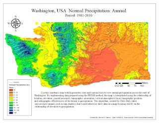
The first map we created was one with continuous symbology. Since the data was already presented with a stretched color scheme, there was not much editing to the data required to get the map on the right track. Creating this map only required adjusting the color ramp's labels to round numbers, changing the color ramp to precipitation, adding hillside effect for more detail, and using an independent data frame to complete the legend as the legend had to be converted to a graphic before it would display with the correct orientation and label placement in ArcMaps.
I explained in my process summary that continuous tone symbology shades each point on a surface with
a gray tone (or in this case the precipitation color gradient) that is light or
dark (warm or cold) respective to low or high values. The colors are found in a
color gradient rather than color classes, which may make it more difficult to
associate numbers with specific locations, but presents the enumeration units
as a smooth surface. I implemented continuous tone symbology in my map by
showing the annual precipitation as a stretched color symbolization over the
state of Washington. I added a hillshade effect to incorporate relief into the
surface and changed the legend to round numbers. The dark red tones depict low
precipitation while the dark blue tones depict high precipitation in inches.
The second map we created was one with hypsometric tents displayed below. The creation of this map included using the spatial analysis tool to convert the floating raster data used in the continuous tones into 10 integers manually. Then, I created contours and checked the box by “Hillshade Effect” in the Layer Properties window of the Annual
Precipitation (in.) layer. Next, contours are added as another element of clarity. The result displayed annual precipitation while maintaining
the mountainous landscape of Washington, which enhanced the ability for the
audience to visualize a 3-D surface that relates to the data.
Hypsometric maps are best for an audience that wants to know an appropriated range for their specific location in a class instead of a relative area on a the gradient.
The maps we created this week were simple enough to make, but the background information was much easier to understand when applied to the map creation process. The only struggles I faced were manually creating the ranges as I wanted them on the hypsometric map. It took me a little while to figure out how to get the data and labels to display properly, but I was able to work it out.


Comments
Post a Comment